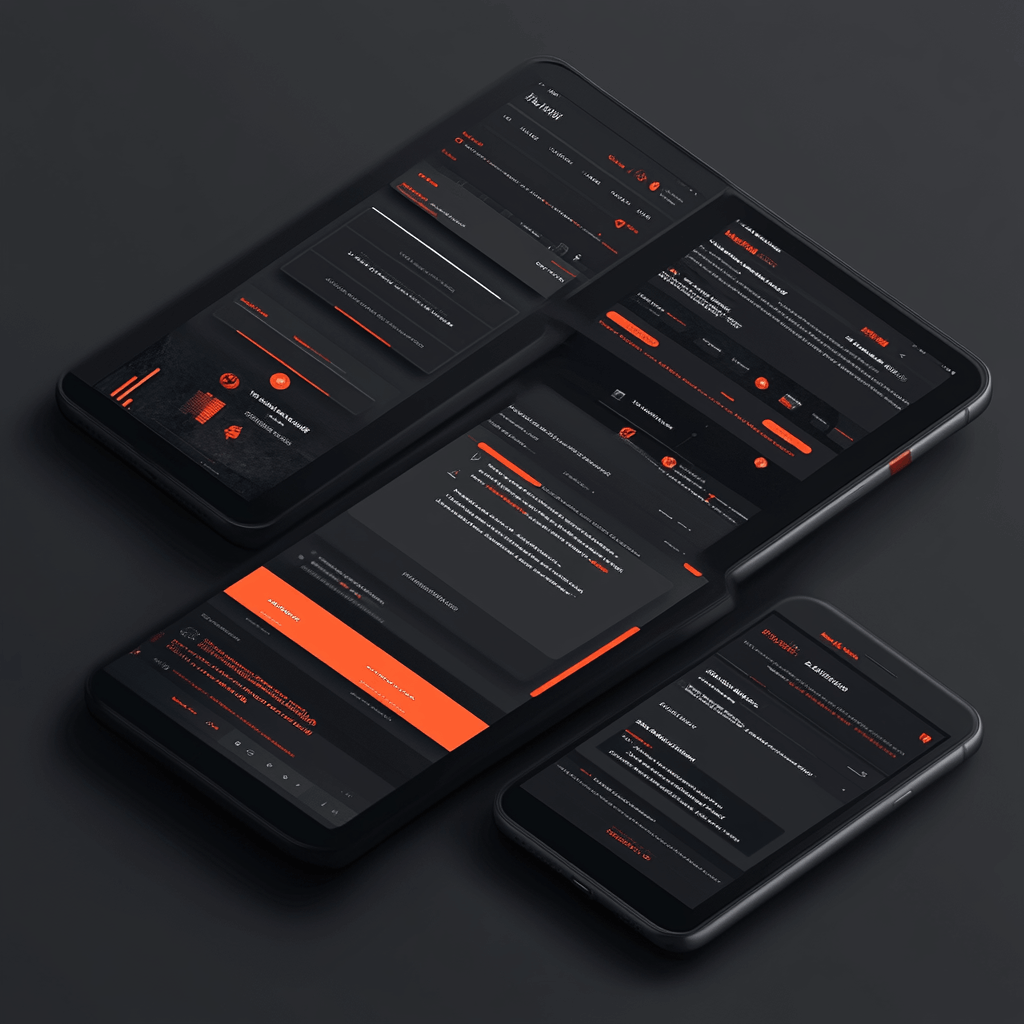
Responsive Design
Responsive design is essential for creating a consistent and enjoyable user experience across various devices and screen sizes. At RocketDigitalLab, we specialize in designing responsive websites and applications that adapt fluidly to different devices, ensuring optimal performance and usability.
What We Do:
1. Fluid Layouts
We use fluid layouts to ensure that your website or application adjusts seamlessly to different screen sizes and resolutions. This approach allows content to resize and rearrange dynamically based on the user’s device.
2. Adaptive Images
Optimizing images to load quickly and display correctly on all devices, enhancing performance and user experience.
3. Mobile-First Design
Prioritizing mobile design to ensure that the user experience is optimized for smaller screens and touch interactions before scaling up for larger devices.